1. 클론 페이지 5
2. 클론 페이지 6
3. 소스코드
금요일이 되어 드디어 마지막, html css 클론 시간이었다. 경일게임 아카데미의 footer 부분 이외에 마지막 부분 이외에 커리큘럼 홈페이지와 가이드 홈페이지를 클론을 진행하였다.
1. 클론 페이지 5
1. 클론 할 화면 - 1

커리큘럼 홈페이지를 클론 하기 앞서 어떤 식으로 클래스를 감쌓주고 텍스트박스와 item요소들을 지정할지 고민하였다. 반응형 웹으로 개발하기 위해, 화면을 줄이면서 어떤 식으로 반응하는지 살펴보았다. 화면이 특정 px 보다 작아졌을 시 네 가지 아이템이 보이다가 두 가지 아이템만 보이도로 반응하였다. 이를 구현하기 위하여 전체를 묶어주는 컨테이너박스 아래에 title-box와 box-wrapper로 감쌓주었고, box-wrapper 아래에 div > class box > class square, p 태그를 이용하여 두 개를 div로 묶음처리하여 웹이 작아진 상황에 4개에서 2개가 보이는 반응형 웹을 개발하였다.
1. 예상 클론 레이아웃 - 1
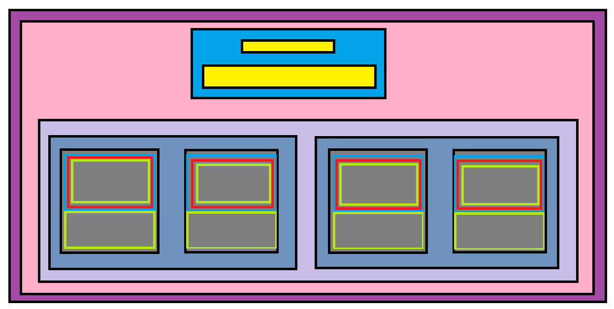
1. 클론 후 화면 - 1

2. 클론 페이지 6
2. 클론 할 화면 - 2
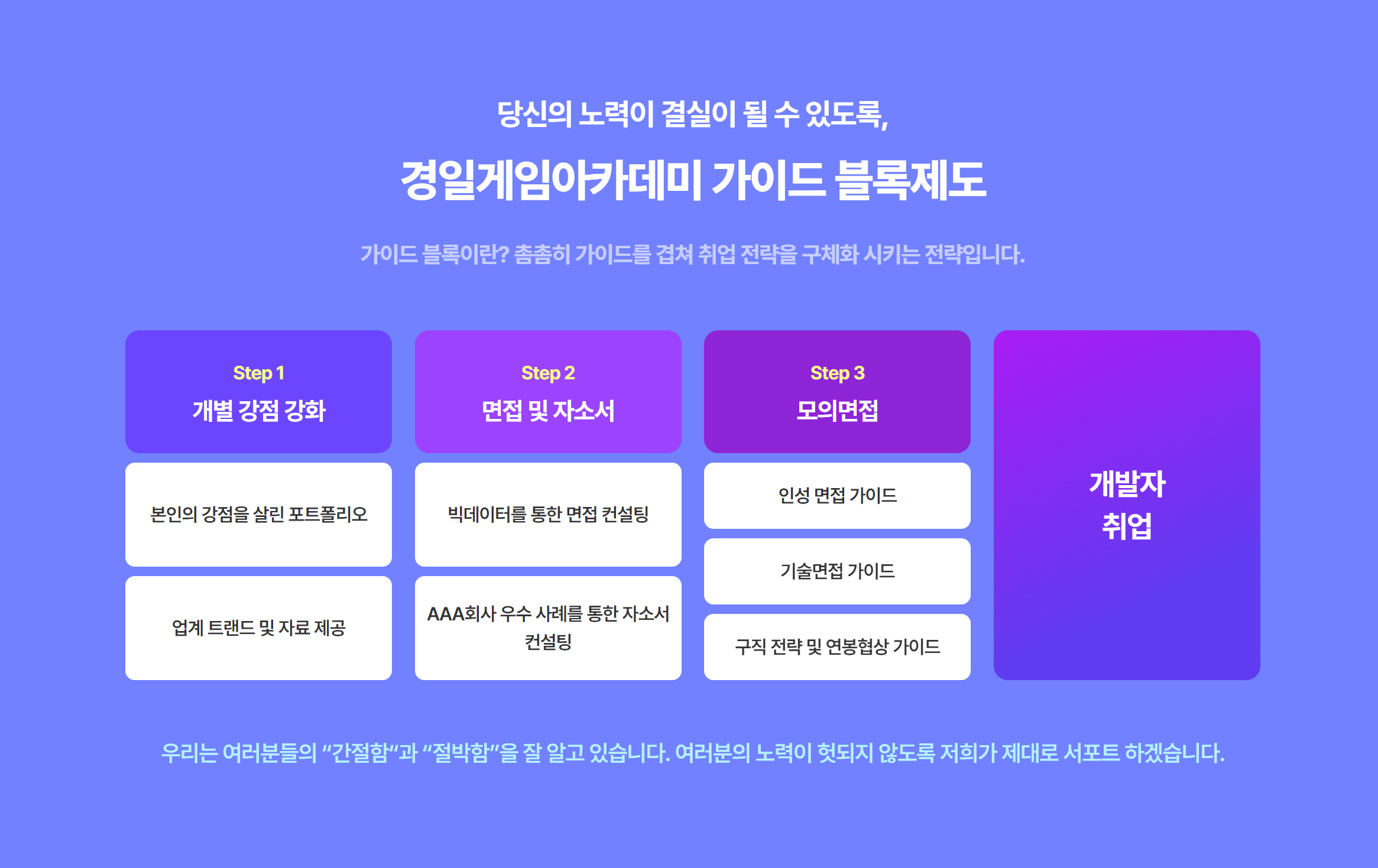
가이드 페이지를 클론 하면서 살짝 까다로웠던 점은 전체를 묶어준 이후 flex 형태로 박스들을 배치하였지만, 각각의 아이템 박스들이 3, 3, 4, 1 개의 아이템을 가지고 있어 그대로 속성을 적용한다면 화면이 깨진다는 것이었다. 이를 해결하기 위해 부모속성과 자식 속성에 flex를 모두 부여하고 각각의 차일드를 찾아서 직접 색을 부여하였다.
2. 예상 클론 레이아웃 - 2

2. 클론 후 화면 - 2

일주일 동안 여러 가지의 클론을 진행하면서 html, css의 기본적인 요소들과 속성들을 이해하였고, 인라인과 블록형식, 반응형 웹을 개발할 때 어떤 식으로 각각의 아이템박스들을 묶어줄지 고민하였다. 이를 바탕으로 내가 원하는 포지션에 원하는 것들을 적절히 배치하여 디자인하여 웹에서 보이는 부분을 꾸밀 수 있을 것 같다. 특히 flex 부분과 마진과 패딩에 간격에 대한 것들이 이해가 부족하여 이 부분을 공부한다며 더 좋을 것 같다.
3. 소스코드
3. curriculum, html
<div id="curriculum">
        <div class="container">
          <div class="title-box">
            <h1>KYUNGIL CURRICULM</h1>
            <h2>여러분이 준비하시게 될 것</h2>
          </div>
          <div class="box-wrapper">
            <div>
              <div class="box">
                <div class="square">
                  <div><div class="img"></div></div>
                </div>
                <p>
                  3가지 <br />
                  포트폴리오
                </p>
              </div>
              <div class="box">
                <div class="square">
                  <div><div class="img"></div></div>
                </div>
                <p>
                  Git을 활용한 <br />
                  업무관리
                </p>
              </div>
            </div>
            <div>
              <div class="box">
                <div class="square">
                  <div><div class="img"></div></div>
                </div>
                <p>
                  경쟁력 있는 <br />
                  자소서와 기술문서
                </p>
              </div>
              <div class="box">
                <div class="square">
                  <div><div class="img"></div></div>
                </div>
                <p>
                  모의면접을 통한 <br />
                  1:1 피드백
                </p>
              </div>
            </div>
          </div>
        </div>
      </div>
4. curriculum.css
#curriculum {
  background-color: rgb(20, 142, 218);
  padding: 7rem 0;
  /* display: none; */
}

#curriculum .box-wrapper {
  margin-top: 6rem;
}

#curriculum .box-wrapper,
#curriculum .box-wrapper > div {
  display: flex;
  gap: 1rem;
  flex: 1;
  flex-wrap: wrap;
  min-width: 30rem;
}

#curriculum .box-wrapper .box {
  flex: 1;
  border-radius: 2rem;
  overflow: hidden;
}

#curriculum .box-wrapper .box p {
  background-color: beige;
  padding: 2rem 0;
  margin: 0;
  font-size: 1.3rem;
  font-weight: 900;
  text-align: center;
}

.img {
  width: 100%;
  height: 100%;
  background-color: yellow;
}

/* @media only screen and (min-width: 30rem) {
} */
3. guide.html
<div id="guide">
        <div class="container">
          <div class="text-box">
            <h1>
              <span>당신의 노력이 결실이 될 수 있도록,</span><br />
              경일게임아카데미 가이드 블록제도
            </h1>
            <p>
              가이드 블록이란? 촘촘히 가이드를 겹쳐 취업 전략을 구체화 시키는
              전략입니다.
            </p>
          </div>
          <div class="step">
            <div class="box-wrapper">
              <div class="item-box">
                <div>
                  <h2>Step1</h2>
                  <h1>개별 강점 강화</h1>
                </div>
                <div>본인의 강점을 살린 포트폴리오</div>
                <div>업계 트랜드 및 자료 제공</div>
              </div>
              <div class="item-box">
                <div>
                  <h2>Step2</h2>
                  <h1>면접 및 자소서</h1>
                </div>
                <div>빅데이터를 통한 면접 컨설팅</div>
                <div>AAA회사 우수 사례를 통한 자소서 컨설팅</div>
              </div>
            </div>
            <div class="box-wrapper">
              <div class="item-box">
                <div>
                  <h2>Step3</h2>
                  <h1>모의면접</h1>
                </div>
                <div>인성 면접 가이드</div>
                <div>기술면접 가이드</div>
                <div>구직 전략 및 연봉협상 가이드</div>
              </div>
              <div class="item-box">
                <div class="bg-gradient">
                  <h1>개발자 <br />취업</h1>
                </div>
              </div>
            </div>
          </div>
          <div class="footer">
            우리는 여러분들의 “간절함“과 “절박함”을 잘 알고 있습니다. 여러분의
            노력이 헛되지 않도록 저희가 제대로 서포트 하겠습니다.
          </div>
        </div>
      </div>
3. guide.css
#guide div {
  /* border: 1px solid black; */
}

#guide {
  background-color: lightskyblue;
  padding: 7rem;
}

#guide .text-box {
  text-align: center;
  color: white;
  margin-bottom: 3rem;
}

#guide .text-box span {
  font-size: 1.3rem;
}

#guide .text-box p {
  font-weight: 900;
  opacity: 0.5;
}

#guide .step {
  display: flex;
  flex-wrap: wrap;
  gap: 1rem;
}

#guide .step .box-wrapper {
  flex: 1;
  display: flex;
  flex-wrap: wrap;
  gap: 1rem;
}

#guide .step .box-wrapper .item-box {
  flex: 1;
  display: flex;
  flex-direction: column;
  gap: 0.5rem;
  text-align: center;
}

#guide .step .box-wrapper .item-box div {
  padding: 1rem 0.5rem;
  flex: 1;
  display: flex;
  justify-content: center;
  flex-direction: column;
  align-items: center;
  border-radius: 1rem;
  background-color: white;
  font-weight: 900;
}

#guide .step .box-wrapper .item-box h1,
#guide .step .box-wrapper .item-box h2 {
  margin: 0;
}

#guide .step .box-wrapper .item-box h2 {
  font-size: 1.3rem;
  margin-bottom: 0.5rem;
  color: yellow;
}

#guide .step .box-wrapper .item-box h1 {
  color: white;
}

#guide .step .box-wrapper:first-child .item-box:first-child div:first-child {
  background-color: cadetblue;
}

#guide .step .box-wrapper:first-child .item-box div:first-child {
  background-color: pink;
}

#guide .step .box-wrapper .item-box:first-child div:first-child {
  background-color: blue;
}

#guide .step .box-wrapper:last-child .item-box:last-child div:first-child {
  /* background-color: brown; */
  /* background: linear-gradient(to bottom, red, blue); */
}

#guide .step .bg-gradient {
  background: linear-gradient(to bottom, red, blue);
}

#guide .footer {
  text-align: center;
  font-size: 1.2rem;
  font-weight: 900;
  margin-top: 4rem;
  color: blue;
  opacity: 0.5;
}
'블록체인 개발 > 클론코딩' 카테고리의 다른 글
| 코인마켓캡 클론 코딩 - 2 (1) | 2023.07.18 |
|---|---|
| 코인마켓캡 클론 코딩 (1) | 2023.07.17 |
| 경일게임 아카데미 클론코딩 - 4 (0) | 2023.06.22 |
| 경일게임아카데미 클론코딩 - 3 (0) | 2023.06.21 |
| 경일게임아카데미 웹사이트 클론하기- 2 (0) | 2023.06.20 |